Wednesday 30 October 2013

Digipak photos


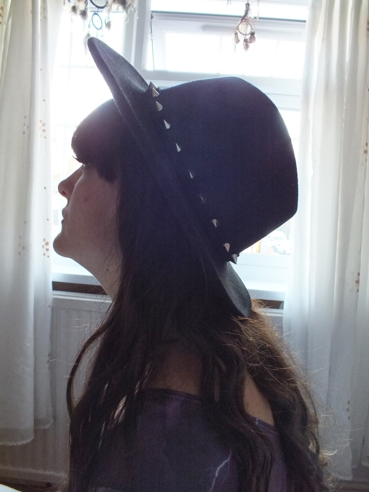
On Wednesday 30th October, we decided to take photographs for our digipak. We shot the photos at my house but we also went outside and got some scenery from roads and a park, in order to make it look more realistic and rural.


Journal - Tracklisting

For our digipak, we chose the title 'Indigo' which we feel is appropriate for our image because it's quite artsy and unique. We know that our title and tracklisting needs to match our artists in order to be appropriate and for it to make sense. I need to make my tracklisting as unique as our title.
We looked into digipaks and albums and saw that 12 songs included was the most common, which we liked and we decided to give our digipaks 12 songs.

Below is the tracklisting I will use on my digipak:

  1. These Days
  2. Youth Knows No Pain
  3. Empty Hand
  4. Dirty Little Lies
  5. No More
  6. State Of The Art
  7. Cheating On You
  8. The Real Thing
  9. Distortion
  10. Never Again
  11. Endlessly
  12. Another Life

Tuesday 29 October 2013

Journal - Digipak Updates

Now that it's half term break, we've decided that we're definitely going to take the pictures we need for our digipak this week. We've decided on our outfits and our locations and we've got the camera and tripod - ready to take the photos. We are just organising a day when we are both not busy in order to spend the whole day taking the images - experimenting with different shots as well as our planned ones just in case we decide that a spontaneous shot looks better. Although I think that our ideas are quite good and that the amount of time we've spent on them shows that we've made effort to show that we are committed and that we know what we need to include in order to be genre specific and able to portray our artist successfully.

These are my final ideas for my digipak:


(Top right, Album Cover. top left Tracklisting, All others are inside panels)


Wednesday 23 October 2013

Journal - Planning Music Video


This is a prezi I created to show the plans we've started to make for our music video. We are almost fully bringing it all together in order to storyboard fully and to begin to shoot the video.

Journal - Update on Digipak plans

We've decided to change some of our digipak ideas. My changes are quite different to the original idea. Instead of having such a strong polaroid and photography theme throughout the digipak, I'm going to make it a lot more urban. I've decided to make my digipak a lot more focused around her image and feature a lot more close ups of my artist, Isla Harris. We looked at other front covers in order to get some inspiration and these are some of my favourites and which I think would be very interesting to use.
I love this cover because of how there are different colours on the cover but it is still just the same image. I've taken a lot of inspiration from this one in particular because of that and I think that the colour scheme would be a really good thing to play around with for my digipak cover.
However, what I didn't like was the triangles on the cover and how it wasn't that easy to see her name and the album title. I think that it would be really interesting to make my artist look at the camera instead of having her eyes closed and maybe use her arms to bring attention to her a bit more.

This album cover is also one which I was really inspired by, I absolutely loved the idea (again) of having different sections in a different colour. I think that it would be a good way to get our image across if I could use more colours on the cover and tint certain parts of the image like it has been done here. However, I wouldn't make it as linear and square as this album cover looks. I also love the handwritten text element. I think that is a great way to show that our artist is very unique and feminine.
I don't like the white background behind the text of her name though, I feel like it really takes away from the nice theme of the whole cover.

Monday 21 October 2013

Audience Feedback from Pitch


After presenting our pitch, the class gave us feedback sheets with their thoughts and critiques. We found that everyone thought that our artist's image was very good and that we successfully showed that our current ideas matched our image. Everyone thought that the overall idea was good, as we were told it was well on the way to success and also that is has potential. We are also proud of our choice with the record label, as everyone else also agreed that it was well chosen and that we were right in choosing it. However, people did want to hear more of the song that we played and they also wanted to know the lyrics more; in order to see if our visuals and music would have a strong relationship. We also expected to have needed progress for our music video as we still haven't made definite decisions on what we're going to include in every shot, and our feedback shows that they would of liked to have known a bit more. Also we did overlook one piece of our audience feedback about the theme of flowers being too girly, but we have decided that although we'll still use the floral patterns, we just won't use it as much.


Music Video Pitch

This is us presenting our pitch to our audience who were about to give us feedback on it. We're happy with the way it went as we feel like we worked well as a team to present equally and to support one another when necessary.

Friday 18 October 2013

Journal - Outfit Planning

After long discussion, me and Kerry decided that because we want our artist to be very stylish but also very similar taste to our target audience, we chose outfits from what we already had. We wanted the lightning element to match our idea for using a galaxy background for our digipaks. I think that these are great choices for our artists because they are stylish and it is believable that a female solo pop artist would wear them.


Wednesday 16 October 2013

Journal - CD

This is an idea I have for my two CDs in my digipak, I'm still unsure whether I need to take a primary photograph of flowers for this, but this is just a practise and I will re-do it if I need to. I really like the idea of having a floral CD because I feel like it really matches my digipak, and whilst our survey answers said that floral pattern was very girly, I like that aspect and I think that it's definitely something I want to keep included with my digipak and my artist. 

Journal - Production planning

Today, I carefully planned out when I am going to take the images for my digipak and have decided or made note of when I am going to take them and what they will include.

I have been planning where I am going to take the majority of my images and most of them are going to be taken at my house, near where I live and maybe at a train station. I know for certain that my artist will always have excessive make up, but it will look good. Also she will always be fashionable and stylish.


Digipak discussion

This is the discussion me and Kerry had today in which we spoke about our digipak ideas and how we would actually go about making them. We recorded it in order to make sure we keep everything and all our ideas on our blogs.
 

Tuesday 15 October 2013

First attempt at storyboarding

These are 15 panels of our storyboard so far, whilst we haven't made it completely perfect and we haven't finished, it's shows that we've decided on the beginning part of our music video. We still need to go through the song and decide on what to do at the chorus' but other than that we have strong ideas about content and location.


Monday 14 October 2013

Logo


This is our final logo.

We were certain that we wanted a font which was calligraphy, and we wanted to include our floral pattern somehow. Whilst the floral butterfly could make our artist look more girly, we'd like to keep it. We've decided that the background is too much for a logo and that it wouldn't look good on a digipak or album cover. We will go back and edit our logo, we will take the background out and make it transparent.

The image below was the first design for our logo.


Artist Pitch


This is the pitch we have created for our artist and our ideas and work so far. It sums up all over our previous work and it sells our artist; informing everyone about our artist and how we decided on everything.

Audience Feedback

These are the answers we received from our online survey, they show that we were very accurate to assume our target audience and gender (16-26, female). However, our feedback did tell us that they thought the whole floral theme seemed very girly, on the other hand, we were told that it was also quite alternative mostly, rather than both pop and alternative. However, I think we like that aspect. 


The most of the feedback we received was positive and we are overall happy with the feedback so far (although it has only been responded to by 5 people) but we think that we were successful in our brief and we definitely represented our artist the way we wanted.


Friday 11 October 2013

Digipak ideas

These are the ideas I have for my digipak so far. I will probably change my ideas along the way but I have some rough drawings of my original ideas. 


This would be the back, with the tracklisting at the bottom - the image would be of Isla in the middle holding her camera, with the backdrop of London and friends. This image would be really focused on her fashion.


This would be the section in the middle of the digipak, saying thank you to fans and crediting the people involved. I would like to continue the picture theme and have it in a frame, covered with flower petals.


I think that two of the panels for my digipak should be artistic and contributing to the theme of images and memories. I would make the two panels look really home made and like a scrapbook.


This would be the cover of the digipak, it would be a close up of a polaroid and it would feature our logo and the digipak title 'Indigo'. I would have Isla Harris on the polaroid and have flower petals surrounding.


On the inside of the digipak I would include an image of Isla Harris again focusing on her hair and fashion, due to my research I know that these are important factors for a solo pop artist. She would also be taking a photo, which links in with the photography theme.


I would have two CDs in my digipak, but they would have the same design of a floral pattern, the same flowers I use for the petals all the digipak. The CDs would slip into folds in the digipak, allowing me more space to have images and to make it more interesting.


This is the page I used to brainstorm some ideas for myself and when helping Kerry whist she helped me come up with ideas.